How Astro’s Data Graph Helps Data Engineers Run and Fix Their Pipelines
3 min read |
As data becomes more democratized and increasingly essential to business decisions, failures or delays in a data pipeline become more disruptive. But when a pipeline fails in Airflow, it’s often hard for data engineers to know where and when the failure has occurred. As a result, they spend critical time searching for what might be a simple issue before they can diagnose it or come up with a cure.
To quickly solve pipeline breakdowns, data engineers need to be able to monitor the data as it flows through those pipelines, and understand how everything across an environment fits together. That's why Astronomer has developed a rich set of observability features in Astro that help data engineers quickly troubleshoot and resolve pipeline problems.
Data Graph: An Extensive View of Your Data Pipelines
One of the most crucial pipeline observability features in Astro is the Data Graph, which lets data engineers see cross-team dependencies and view performance and quality information over time. Additionally, the Data Graph helps detect and troubleshoot when data is late or has data quality issues, and can visualize changes that occurred in the pipeline.
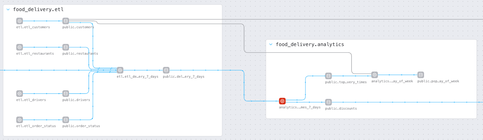
Figure 1: The Data Graph in Astro showing two Airflow DAGs named etl and analytics. These DAGs depend on each other and form part of a larger data pipeline for a food delivery service.
Clicking on any node in the Data Graph will highlight that node's upstream and downstream dependencies and display additional metadata and status information about the job run.
For tasks, you'll see the SQL or Python/Bash code that task uses, as well as the duration trendline for the historic runs of that task and a Gantt chart showing where that task sits in the overall pipeline.
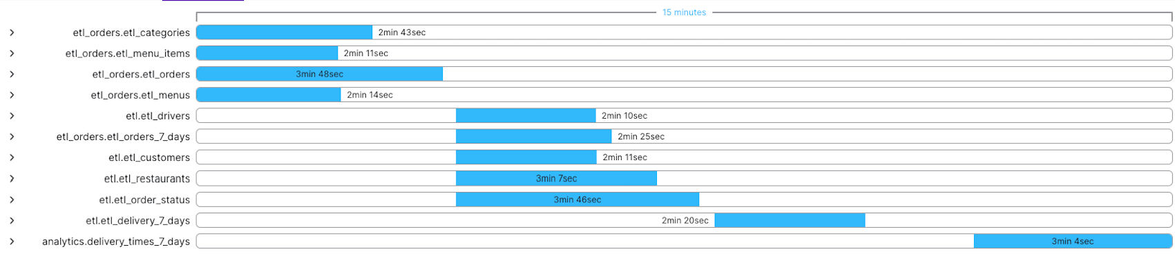
Figure 2: Gantt chart depicting the overall duration of a data pipeline, including all the upstream dependencies of the current node.
For datasets, the Data Graph shows the schema of the dataset and any size and quality check information that’s been collected over time.
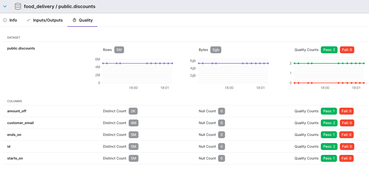
Figure 3: Data quality information captured over time for a Dataset named public.discounts. We can see the size of the Dataset in terms of rows and bytes, and the results of quality rules at both the table and individual column level.
The Data Graph has additional features, including:
- Tasks are grouped by pipeline and can be collapsed/expanded as needed to help you view and navigate large graphs.
- Tasks that failed in the most recent run, or datasets that failed quality checks in the most recent run, are highlighted.
- You can compare runs of the pipeline and "diff" the changes between them. For example, you can compare a recent failing run to a successful run, and the graph will highlight the nodes that changed between those runs.
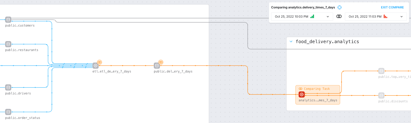
Figure 4: View of a pipeline run comparison in the Data Graph. When comparing runs, the failed task appears in red, while the point where the comparison starts is highlighted in orange. The dataset and task immediately preceding the failure show orange lines with “diff" marks next to them, highlighting changes; blue lines with no “diff” marks mean no other changes occurred further upstream.
For data engineers, issues such as data availability, timeliness, quality, and lineage have become more important to a company's overall health and are increasingly complex. With the Data Graph in Astro, engineers now have a better, more efficient way to understand, communicate, and solve pipeline problems.
To learn more about our fully managed data orchestration platform, Astro, reach out for a demo customized around your needs.

Get started free.
OR
By proceeding you agree to our Privacy Policy, our Website Terms and to receive emails from Astronomer.