> ## Documentation Index
> Fetch the complete documentation index at: https://astronomer.io/docs/llms.txt
> Use this file to discover all available pages before exploring further.

# Metrics in Astronomer Software

On Astronomer, metrics generated by StatsD and the Kubernetes API via Prometheus are funneled into a set of [Grafana](https://grafana.com/) dashboards that allow you to monitor the status of all Airflow Deployments on your cluster.

All dashboards provide real-time, up-to-date information on the status of the Astronomer platform both at the cluster and individual Pod level.

If you're interested in customizing the pre-built dashboards to create other views or compile additional metrics, skip to [Creating custom dashboards](/docs/astro-private-cloud/v-0-34/grafana-metrics#create-a-custom-grafana-dashboard).

## Access Grafana

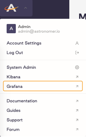
By default, users with [System Admin permissions](/docs/astro-private-cloud/v-0-34/role-permission-reference#default-role-permissions-lists) can access Grafana. To access Grafana from the Software UI:

1. As a System Admin, open Grafana from the Software UI:

   <Frame>
     <img src="https://mintcdn.com/astronomer/Y4ECG_oXFqNq6mgi/images/software/ui-access.png?fit=max&auto=format&n=Y4ECG_oXFqNq6mgi&q=85&s=faed8e3f4f50b9abca9cc716db355eba" alt="Create Grafana Dashboard" width="299" height="474" data-path="images/software/ui-access.png" />
   </Frame>

2. Log in to Grafana. If you're on the Welcome page, you can log in via the **Sign In** button at the bottom of the sidebar menu. The default login credentials are `admin:admin`.

   <Frame>
     <img src="https://mintcdn.com/astronomer/XZk5DsNifaMN7o1r/images/software/grafana-signin.png?fit=max&auto=format&n=XZk5DsNifaMN7o1r&q=85&s=dfde6ebc0e9adebfc81476a2cd7438ab" alt="Login button" width="200" height="103" data-path="images/software/grafana-signin.png" />
   </Frame>

3. Click the search button to access all published dashboards.

   <Frame>
     <img src="https://mintcdn.com/astronomer/Y4ECG_oXFqNq6mgi/images/software/search-button.png?fit=max&auto=format&n=Y4ECG_oXFqNq6mgi&q=85&s=b3a03f313405a916462a64943ca53a01" alt="Grafana search button" width="379" height="183" data-path="images/software/search-button.png" />
   </Frame>

<Note>
  As a System Admin, you can see metrics in Grafana for all Airflow Deployments on your cluster. You do not have to be a member of a Workspace to access Grafana metrics for Deployments within that Workspace.
</Note>

### Change the Grafana admin password

By default, the credentials for Grafana are `admin:admin`. To change the password:

1. Run the following command to access the Grafana Pod in your Astronomer installation:

   ```bash wrap theme={null}
   kubectl exec -it <grafana-pod-name> -n astronomer -- bash
   ```

   Replace `<grafana-pod-name>` with the name of your own Grafana Pod.

2. Run the following command to open the Grafana configuration folder:

   ```bash wrap theme={null}
   cd $GF_PATHS_HOME
   ```

3. Run the following command to reset your Grafana password

   ```bash wrap theme={null}
   grafana-cli admin reset-admin-password '<new`-password>'
   ```

   Replace `<new-password>` with your desired new password.

4. Confirm that the change was applied by logging in to Grafana with the new credentials.

### Filter metrics by Airflow Deployment

Grafana dashboards that display cluster-level metrics often allow you to filter by `namespace` or `Deployment`. On Astronomer, every Airflow Deployment has a unique release name that is immutable and corresponds to a Kubernetes `namespace`. For example, all Pods for a Deployment whose release name is `elementary-zenith-7243` run within the `astronomer-elementary-zenith-7243` namespace on your cluster. Once you know the release name for a Deployment, you can use it in Grafana to show metrics only for that Deployment.

To filter Grafana metrics by Deployment:

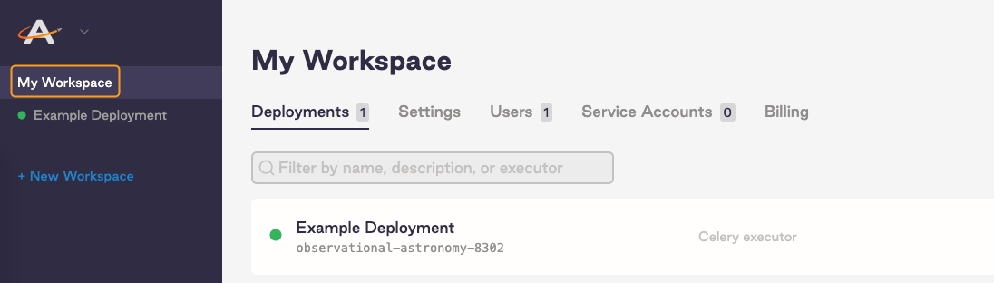
1. In the Software UI, click on a Workspace to see a list of all Deployments in that Workspace.

   <Frame>
     <img src="https://mintcdn.com/astronomer/XZk5DsNifaMN7o1r/images/software/click-workspace.png?fit=max&auto=format&n=XZk5DsNifaMN7o1r&q=85&s=f7dbf0846510489242cc56c18b51ab68" alt="Open Workspace in the Software UI" width="1096" height="312" data-path="images/software/click-workspace.png" />
   </Frame>

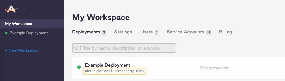
2. The release name for a Deployment is listed under the Deployment's proper name. Make note of the release names for each Deployment you want to monitor.
   <Frame>
     <img src="https://mintcdn.com/astronomer/Y4ECG_oXFqNq6mgi/images/software/release-name.png?fit=max&auto=format&n=Y4ECG_oXFqNq6mgi&q=85&s=6f542955531679977d73c2be7e741181" alt="Release name location" width="1096" height="312" data-path="images/software/release-name.png" />
   </Frame>

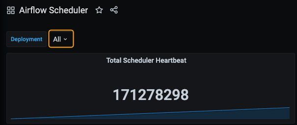
3. In Grafana, open a dashboard. Click the menu under the Deployment's name to see a list of all release names in your cluster. Depending on which dashboard you're using, the name of this menu is either **Deployment**, **Release Name**, or **Namespace**.
   <Frame>
     <img src="https://mintcdn.com/astronomer/Y4ECG_oXFqNq6mgi/images/software/select-release-name.png?fit=max&auto=format&n=Y4ECG_oXFqNq6mgi&q=85&s=fc6c2638bcb7e09be50b4af68cf08a58" alt="Release name menu in Grafana" width="605" height="255" data-path="images/software/select-release-name.png" />
   </Frame>

4. Select one or multiple release names for the Deployments you want to monitor.

Read the rest of this guide to learn about Astronomer's built-in Grafana dashboards, as well as key metrics for tracking the overall health of your platform.

## Platform overview

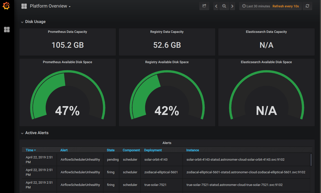
This dashboard shows the amount of persistent storage available to Prometheus, the platform's Docker registry, and Elasticsearch across your entire platform. Use this dashboard to track system-wide behaviors and issues.
<Frame>
  <img src="https://mintcdn.com/astronomer/Y4ECG_oXFqNq6mgi/images/software/platform_overview.png?fit=max&auto=format&n=Y4ECG_oXFqNq6mgi&q=85&s=db34ee69a0ae6068f0a69037c3832fb0" alt="Astronomer Platform" width="1272" height="764" data-path="images/software/platform_overview.png" />
</Frame>

### Key metrics

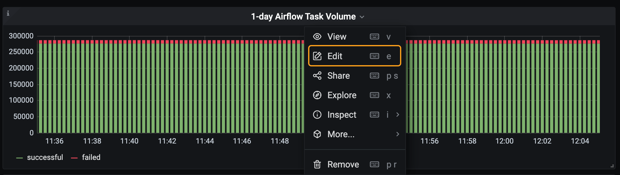
* **1-day Airflow Task Volume:** This metric is the single best tool for monitoring Airflow task successes and failures, as well growth in volume. It can also be adjusted to better find specific data points.

  For instance, if you click **Edit** in the dropdown menu for the metric, you're able to update the **Metrics** query to show data for a specific time, status, or Deployment.
  <Frame>
    <img src="https://mintcdn.com/astronomer/Y4ECG_oXFqNq6mgi/images/software/task-volume.png?fit=max&auto=format&n=Y4ECG_oXFqNq6mgi&q=85&s=d03806831211d09ddfd7d7f17c07b0e0" alt="1-day Airflow Task Volume Metric" width="1970" height="556" data-path="images/software/task-volume.png" />
  </Frame>

  In the following example, the query has been rewritten in the format `sum(increase(airflow_ti_successes[<time>]))`, which changes the time interval that appears in the metric. We recommend monitoring across longer intervals to clearly identify trends in task failures and successes:

  <Frame>
    <img src="https://mintcdn.com/astronomer/Y4ECG_oXFqNq6mgi/images/software/time-interval.png?fit=max&auto=format&n=Y4ECG_oXFqNq6mgi&q=85&s=e3bbdb05784e48e8488d79058245da58" alt="Task Volume Metric with Modified Time Interval" width="3268" height="1908" data-path="images/software/time-interval.png" />
  </Frame>

  In addition, the eye icon on the metric can be deselected so that only task failures are shown:

  <Frame>
    <img src="https://mintcdn.com/astronomer/XZk5DsNifaMN7o1r/images/software/failures-only.png?fit=max&auto=format&n=XZk5DsNifaMN7o1r&q=85&s=5d422c6018dada50eddf23342078ab09" alt="Failures-Only Task Volume Metric" width="3272" height="1902" data-path="images/software/failures-only.png" />
  </Frame>

  You could also write this query as `sum by (deployment) (increase(airflow_ti_failures[<time-interval>]))` to view task volume across an entire Deployment, which is useful for monitoring potential system-wide problems:

  <Frame>
    <img src="https://mintcdn.com/astronomer/Y4ECG_oXFqNq6mgi/images/software/multiple-deployments.png?fit=max&auto=format&n=Y4ECG_oXFqNq6mgi&q=85&s=3123954f3a4fecb5a279f7ac83e8c22e" alt="Metric Across Multiple Deployments" width="3270" height="1910" data-path="images/software/multiple-deployments.png" />
  </Frame>

* **Database Connections:** This metric can be found in the **Database** panel. It measures how often your database is reached out to by the Airflow scheduler, webserver, and workers. The chart shows the sum total of connections coming from sqlpooling in all Airflow Deployments in your environment:

  <Frame>
    <img src="https://mintcdn.com/astronomer/XZk5DsNifaMN7o1r/images/software/db-connections.png?fit=max&auto=format&n=XZk5DsNifaMN7o1r&q=85&s=73335fc9042533c9c1731c35cf816e87" alt="Database Connections Metric" width="1952" height="590" data-path="images/software/db-connections.png" />
  </Frame>

  This metric is particularly relevant to organizations with more than 20 Airflow Deployments. For optimal database performance, you should keep this number below `max_connections - 300`.

* **PG Bouncer Waiting Clients:** This metric can be found in the **Database** panel. It measures how long specific actions are queued in a given Airflow Deployment before being executed. In healthy Deployments, this number should be very low.

  Extended periods of waiting can degrade performance and should be investigated for potential problems. For example, the Deployments associated with the red and pink spikes in the following graph might be experiencing issues with successfully executing tasks:

  <Frame>
    <img src="https://mintcdn.com/astronomer/XZk5DsNifaMN7o1r/images/software/PGBouncer.png?fit=max&auto=format&n=XZk5DsNifaMN7o1r&q=85&s=3a8de101876ec0dd391631bb08597b5d" alt="PG Bouncer metrics" width="1940" height="594" data-path="images/software/PGBouncer.png" />
  </Frame>

* **Unhealthy Schedulers:**  This metric shows the number of unhealthy schedulers in a given Deployment. It's available in the **Airflow Health** panel, but scheduler health can also be assessed for each individual Deployment in the **Metrics** tab of the Software UI. A scheduler is considered "Unhealthy" if it has not emitted a heartbeat for over 1 minute.

  The lack of a scheduler heartbeat is expected during a code push, but erratic restarts or an "Unhealthy" state that persists for a significant amount of time is worth investigating further.

  For example, an organization would want to investigate the green scheduler in the following screenshot:

  <Frame>
    <img src="https://mintcdn.com/astronomer/Y4ECG_oXFqNq6mgi/images/software/unhealthy-shcedulers.png?fit=max&auto=format&n=Y4ECG_oXFqNq6mgi&q=85&s=f7f41b1b93b68a5de0c05a19587329b5" alt="Unhealthy Schedulers" width="1970" height="610" data-path="images/software/unhealthy-shcedulers.png" />
  </Frame>

* **DAG Parsing Time:** This metric is available in the **Airflow Health** panel. It measures how quickly the scheduler is executing your DAGs, and it's an indicator for how well your scheduler is scheduling jobs for execution:

  <Frame>
    <img src="https://mintcdn.com/astronomer/Y4ECG_oXFqNq6mgi/images/software/parsing-time.png?fit=max&auto=format&n=Y4ECG_oXFqNq6mgi&q=85&s=86bc31525d943ffbd53d358ab6a67d31" alt="Parsing Time Metric" width="1962" height="602" data-path="images/software/parsing-time.png" />
  </Frame>

  Anything under 1 second is considered good, but the lower the measured time the better. Note that operator executions are not included in this metric, as those are typically scheduled for execution in worker pods.

* **Elasticsearch Available Disk Space:** Astronomer utilizes the [ELK stack](https://www.elastic.co/what-is/elk-stack) to power logging, an important part of establishing observability for the platform as a whole. To function successfully, Elasticsearch should always have >20% Available Disk Space. You can monitor this from the “Platform Overview” dashboard to ensure that both task and component logs have been successfully captured and persisted:

  <Frame>
    <img src="https://mintcdn.com/astronomer/XZk5DsNifaMN7o1r/images/software/available-disk-space.png?fit=max&auto=format&n=XZk5DsNifaMN7o1r&q=85&s=71b0ff2b10737a5d3d7b3506f0781d19" alt="Available Disk Space" width="1308" height="528" data-path="images/software/available-disk-space.png" />
  </Frame>

  If this ever dips below 20%, we recommend increasing the replica count in the [Elasticsearch Helm chart](https://github.com/astronomer/astronomer/blob/master/charts/elasticsearch/values.yaml). The Helm changes will look something like the following:

  ```yaml wrap theme={null}
  elasticsearch:
    data:
      replicas: <number>
  ```

## Airflow state

This dashboard includes a high-level view of resource usage and system stress levels. Use this dashboard to monitor all Airflow Deployments running within your Kubernetes cluster in a single view.

<Frame>
  <img src="https://mintcdn.com/astronomer/XZk5DsNifaMN7o1r/images/software/airflow_state.png?fit=max&auto=format&n=XZk5DsNifaMN7o1r&q=85&s=5a594667dfddd6f9d80f72998aa299a9" alt="Astronomer State" width="1272" height="1357" data-path="images/software/airflow_state.png" />
</Frame>

### Key metrics

* **CPU Requests and Memory Requests:** These metrics appear in the **Quotas** panel of the dashboard. Most organizations run Astronomer within a cloud environment and pay for resource usage, so it is important to monitor this dashboard and its associated costs. Due to the varying structure, tools, and pricing models of cloud provider solutions, the recommended values for these metrics will vary between organizations.

## Kubernetes Pods

This dashboard shows several detailed metrics for each Kubernetes pod in your cluster. If you filter by namespace for a particular Airflow Deployment, you can view a dedicated set of metrics for any pod within that namespace.

<Frame>
  <img src="https://mintcdn.com/astronomer/XZk5DsNifaMN7o1r/images/software/kube-pod.png?fit=max&auto=format&n=XZk5DsNifaMN7o1r&q=85&s=ce0d2ebb53074b88a57604d9f021eef1" alt="Kubernetes Pod Dashboard" width="3974" height="1736" data-path="images/software/kube-pod.png" />
</Frame>

### Key metrics

**Pod Status:** This metric shows the status of a single pod within your cluster, and displays one of 5 states [as defined by Kubernetes](https://kubernetes.io/docs/concepts/workloads/pods/pod-lifecycle/#) - `Pending`, `Running`, `Succeeded`, `Failed`, or `Unknown`. The value for this metric is equivalent to the output of `kubectl get pod <pod-name> -n <namespace>`. If you're interested in seeing the status of multiple pods at once, you're free to add a panel to this dashboard.

## Airflow Deployment overview

This dashboard shows a set of resource and health-based metrics for individual Deployments. It is most similar to the one displayed in the **Metrics** tab of the Software UI.

<Frame>
  <img src="https://mintcdn.com/astronomer/XZk5DsNifaMN7o1r/images/software/airflow_deployment_overview.png?fit=max&auto=format&n=XZk5DsNifaMN7o1r&q=85&s=7344d7d7b1bea706d9f83c10f203678a" alt="Astronomer Deployments" width="1252" height="908" data-path="images/software/airflow_deployment_overview.png" />
</Frame>

### Key metrics

**Deployment Status:** This metric indicates whether the selected Deployment is "Healthy" or "Unhealthy", as determined by the state of the pods running within it.

If any pod within an Airflow Deployment's namespace is not in a `Running` state, the Deployment is considered "Unhealthy".

## Fluentd

This dashboard tracks the performance of Fluentd, which writes logs to Elasticsearch. You can use the metrics in this dashboard to track the overall status of logs being emitted from the service.

<Frame>
  <img src="https://mintcdn.com/astronomer/XZk5DsNifaMN7o1r/images/software/Fluentd.png?fit=max&auto=format&n=XZk5DsNifaMN7o1r&q=85&s=c3eb6ff3aa2fabfa1f660802893325c6" alt="Fluentd Dashboard" width="3954" height="1196" data-path="images/software/Fluentd.png" />
</Frame>

### Key metrics

* **Buffer Size and Buffer Length:** These metrics track whether the Fluentd buffer is backed up, which might indicate an issue with writing logs to Elasticsearch. These metrics should ideally be hovering around zero.

## Software UI metrics dashboard

In addition to dashboards in Grafana, each of your Deployments has a built-in metrics dashboard in the Software UI. Any user with access to a given Deployment can access this dashboard. To get there, open a Deployment and go to the **Metrics** tab:

<Frame>
  <img src="https://mintcdn.com/astronomer/XZk5DsNifaMN7o1r/images/software/astro-metrics.png?fit=max&auto=format&n=XZk5DsNifaMN7o1r&q=85&s=15edb9127497bd29fe082daf096d127d" alt="Astronomer Metrics Dashboard" width="3468" height="2182" data-path="images/software/astro-metrics.png" />
</Frame>

This dashboard is most useful for tracking the performance and resource usage of an individual Airflow Deployment, whereas Grafana is most useful for tracking performance at the platform level and across multiple Airflow Deployments.

### Key metrics

* **Usage Quotas**: These metrics show the percentage of maximum pods, CPU, and memory an Airflow Deployment is using within its Kubernetes namespace. The upper limit of each metric is pulled from your platform-level configurations for resource quotas.

  If you're using the Local or Celery executors, these metrics should each show around 50% usage at all times.

  If you're using the Kubernetes executor or the `KubernetesPodOperator` in your DAGs, these metrics should fluctuate based on the number of tasks you're running at any given time. If any of these numbers reaches its maximum, we recommend allocating more computing power by adjusting the **Extra Capacity** slider in the **Settings** tab of your Airflow Deployment.

## Create a custom Grafana dashboard

Because Astronomer's key metrics are distributed across several dashboards, you might want to create custom dashboards that compile the metrics you find most important. To create a custom dashboard:

1. As a System Admin, open Grafana from the Software UI.

2. Log in to Grafana. If you're on the Welcome page, you can log in via the **Sign In** button at the bottom of the sidebar menu. The default login credentials are `admin:admin`

3. In the Grafana sidebar menu, click the **+** icon and click **Create Dashboard**.

4. Specify a visualization type and title for your first panel.

5. In the metric's **Query** tab, open the data source dropdown menu and select Prometheus.

6. In the table below the data source dropdown menu, specify the metric you want to visualize in the **Metrics** field.

7. On the top menu, click the **Add panel** icon to add another panel to the dashboard. Repeat steps 2 and 3 for this panel.

8. Click **Save** to finalize your changes.

As a starting point, we recommend creating a dashboard with the following metrics visualized as graphs for any organizations using the Kubernetes executor or `KubernetesPodOperator` in an Airflow Deployment:

* Node Disk Space Utilization
* Node CPU/Memory Utilization
* Disk IO Utilization
* CPU Utilisation
* Memory Utilization
* CPU Saturation (Load1 per CPU)
* Memory Saturation (Major Page Fails)
* Net Utilization (Bytes Receive/ Transmit)
* Net Saturation (Drops Receive/Transmit)

These metrics can help you monitor resource usage and subsequent costs of your Kubernetes pods. The recommended steady-state values for these metrics all will be specific to your Kubernetes environment and dependent on available resources/configurations. However, if metrics disappear from this view, it is typically an indication of the node going away and worker pods being relocated to another Kubernetes node.